Histograms and CDF’s Part1: What are they?
This is the first part of a two part series on histograms and CDF’s (Cumulative Distribution Function). I find a lot of people new to data science, geostatistics, etc. are usually familiar and comfortable with histograms, however there is a lot to learn from CDF’s which is why I tend to rely on them more. This series will cover the following topics
- What are they?
- Explain what a Histogram and CDF is
- Show what info we can easily read from each graph type
- When should we use them?
- What are the pro’s and con’s of these graphical representations.
TL:DR
At their heart, both the histogram and the CDF (Cumulative Distribution Function) are displaying similar information, but in different ways. A histogram can be thought of as an empirical estimation of the Probability Density Function (PDF) and represents the probability with areas. Technically the PDF would represent this with an “area under the curve”. Histograms are bar plots… so I guess we can say they represent this with the area of a bar! The CDF represents probability with vertical distances and is cumulative.
Note: Example Data
The main plots for this post are all based on the same randomly generated distribution of numbers created using Numpy’s random number generator in Python. To keep it to something most people are familiar with, the distribution is based on a normal distribution. I’m using a small number of data so my distribution is not “perfect” but much more realistic. If you want to see how I do this you can check out my example notebook ex_histograms_and_cdfs which shows all of the plots used in this post.
What’s a Histogram
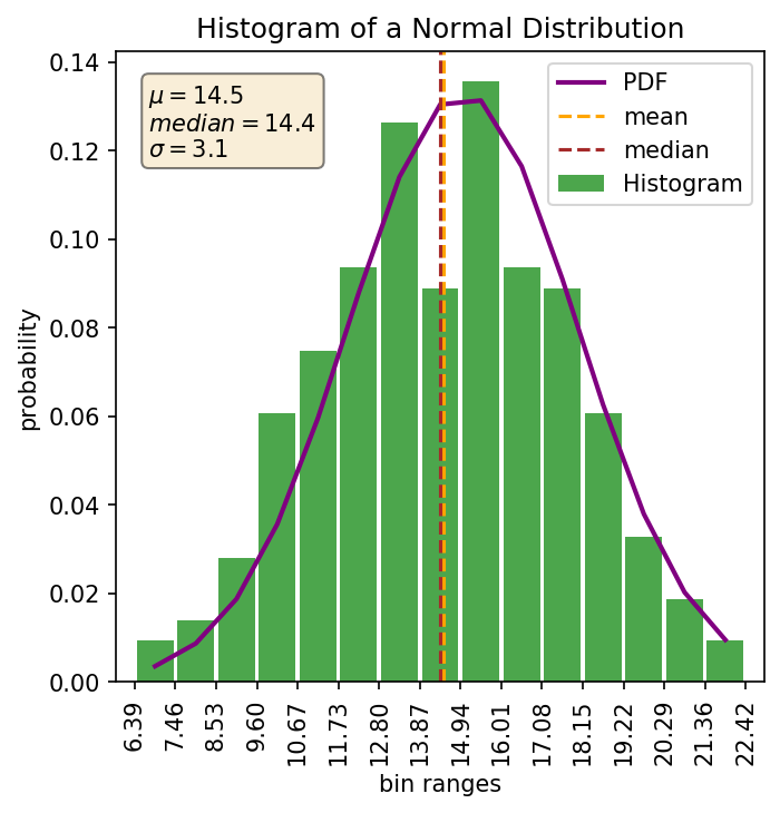
Histograms are one commonly used graphical representation of a distribution of numbers. They are typically plotted in a bar graph style plot where the height of each bar shows the frequency of a bin and represents the probability that a number will fall within that bin. This is in essence a slice of the area under a curve. The width of the bar represents the bin size used to group the numbers (or the width of the slice). The total width of all bars shows the range of values in the distribution. Here’s an example showing the histogram and the estimated PDF for my normal distribution:
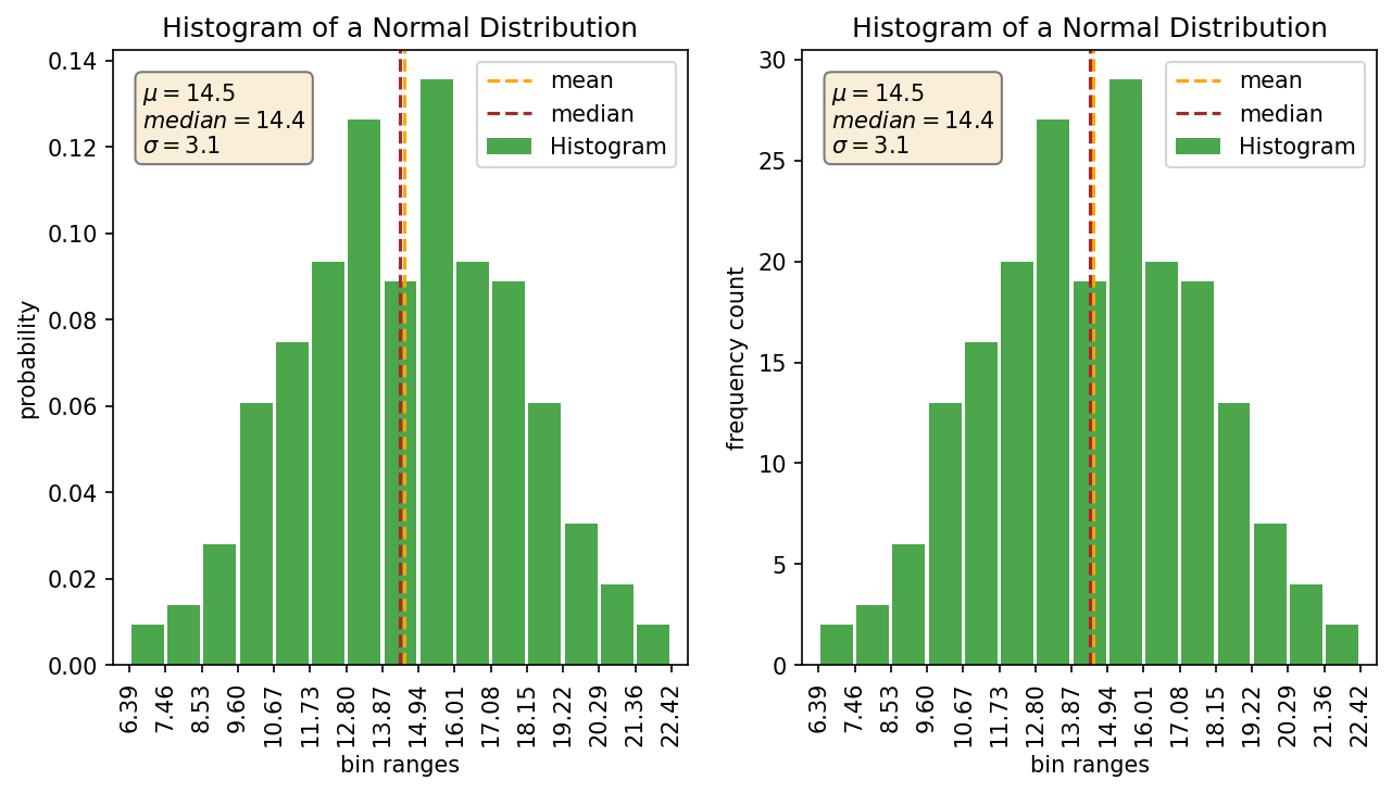
As a quick side note: Many histogram plotting functions/programs out there by default plot a histogram with ‘Frequency’ on the y-axis. I don’t find this vary useful because the frequency doesn’t really mean anything without also knowing the how many samples are in your distribution. If you have a count of 30 samples in a bin and your sample size is 50 then that means something totally different than if you have a sample size of 10,000. Using the ‘Density’ option in numpy/matplotlib/plotly or whatever program you are using will convert it over to a probability value which I find way more useful. Here’s a quick example showing the density plot versus the frequency plot.
What’s a CDF
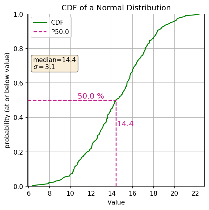
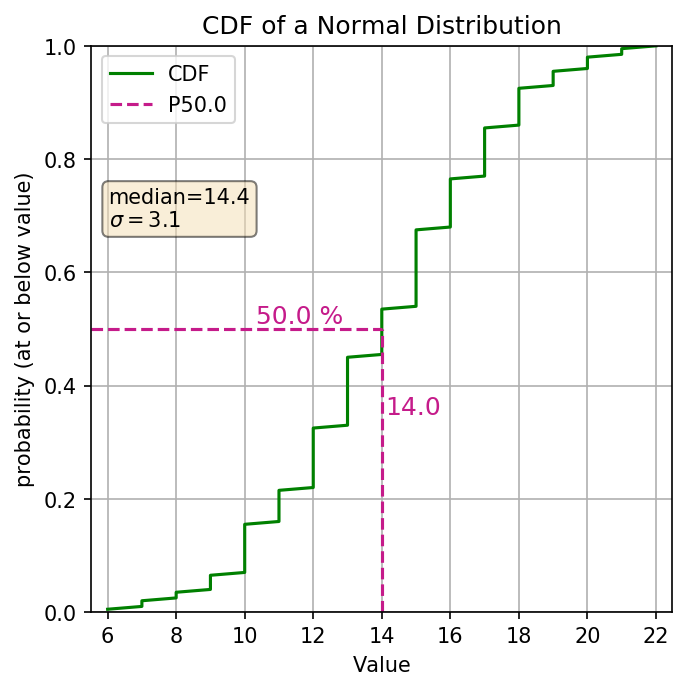
The cumulative distribution function (aka. CDF) is another graphical representation of the distribution of numbers (discrete, or continuous). The y-axis represents the cumulative probability, aka the percentile of your distribution. The x-axis is the values in your distribution (ordered from least to greatest). The line is using vertical distances to show the probabilities. Here’s an example of the same normal distribution.
The CDF also works quite well for categorical distributions. Just be mindful of how the categories are related (ordinal or nominal). Here’s an example of the same normal distribution converted into a categorical distribution by converting all values to integers:
How do we read a Histograms
Ok so you probably already knew what a histogram was, and you might already know how to read a histogram, but to make sure we are on the same page lets look at what the histogram shows us. We’ll take the same normal distribution and plot it’s histogram, but this time in an interactive plot so you can look at some of the values yourself.
First there are a some general pieces of information we can see from the plot without plotting any annotation. These are the range of values, probability of a value within a bin, the general shape of the distribution, the skewness of the distribution, and possible outliers. So lets look at those with the above plot:
| Range of values | 6.39 to 22.42 |
| Probability of value in 4th bin | ~6% |
| Shape of the distribution | Typical normal “bell curve” |
| Skewness | None |
| Outliers | None |
In the above table, we did say there wasn’t any skewness. How do we know that? Well some of it is based on our own loosy-goosy feeling of what the shape looks like. The other way we can get a quick sense is to also plot the mean and median lines and see if they “look” close together. Which brings up another interesting point. You can’t really tell what the mean or median of your distribution is without plotting them. It’s a non-trivial probablem to add up in our heads the probabilities of all the different bins and figure out which bin lies in the middle. Here it might look easy because we are dealing with a normal distribution. In Part 2, we’ll look at a bunch of different distributions, such as the log normal distribution, and you can see how hard it is to actually tell intuitively where your median value is.
How do we read a CDF’s
Now that we know what a CDF is, lets start looking at what sort of information one can glean from this graph. This time we’ll plot up the CDF in an interactive plot. So go ahead and play around with it some!
What are the general pieces of information we can see? The range of values, Percentiles (i.e. P20 is where 20% of the values are less than or equal to that value), Your median (because the median is the P50), anything related to the percentiles (i.e. what values are between the P20 and the P80, or what values lie within +/- 20% of the median). So looking at the above cdf to find the percentile we find the decimal percentile value on the Y axis (P20 = 0.2) drew a line horizontally over to our cdf line and then go straight down, that’s the percentile of our distribution. So let’s look at some of those values for the above plot:
| P20 | 11.6 |
| Median (P50) | 14.4 |
| Values between P20 - P80 | 11.6 to 17.2 |
| Probability of values between 11.6 and 17.2 | 80% - 20% = 60% |
What about the slope of the line? The slope of the line along the CDF also gives us some basic information. This in affect tells us how spread out values are. A steeper slope means that the there is less spread and a shallower slope gives shows a greater relative spread in your data. So if we have a relatively shallow slope at the top or bottom that could be an indication of possible outliers. Also if there is a relatively shallow slope somewhere in the middle of the distribution, that could be a sign of a bimodal distribution.
Summary
Hopefully you have a little bit better understanding of what Histogram’s and CDF’s can show you about your distribution. If you want to get a quick snapshot of your distribution to see what type of distribution you might be dealing with, a histogram is your best bet. But if you want to get a better grasp of the complexities of your distribution and what you are actually dealing with, I find myself flipping back and forth a lot between both the histogram and the CDF. Stay tuned for part 2 where I will show you a bit about some of the pros and cons of using both the histogram and CDF and why, even though I realy more heavily on the CDF myself, I so often find myself flipping back and forth between both of them.